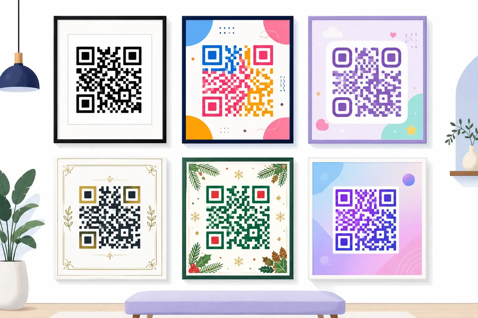
QR Code Colors: Which Colors Work and Which Don't

A boutique owner picks a soft blush pink for her window decal, prints 200 loyalty cards, and watches the first three customers give up — nothing happens when they scan. The design looked beautiful. The scan rate was zero. Choosing QR code colors is where branding and working technology collide, and the rules aren’t what most people assume. Color choice has almost nothing to do with hue and everything to do with brightness. This guide covers how scanners read color, the one contrast rule behind every decision, safe and failing color pairs, and how to keep your brand palette without losing a scan. The short version: dark on light, tested before you print.
How Scanners Actually See QR Code Colors
Point a phone at a QR code and the camera doesn’t register purple, teal, or navy. It sees a field of light and dark. Before any decoding starts, the scanner runs a step called binarization: every pixel is measured for luminance — its raw brightness — and sorted into one of two buckets, dark or light.
This is the insight behind every rule below. Hue is irrelevant; brightness difference is everything. A fire-engine red and a forest green can look completely different to your eye while mapping to nearly the same gray for a scanner. The decoder never learns a module’s color — only which side of the brightness threshold it landed on.
The QR code standard (ISO/IEC 18004) was written around a dark pattern on a light background, and decoders inherit that assumption. Swap black for a color and you aren’t choosing a look — you’re choosing a brightness value, and all that matters is how far it sits from your background.
Key takeaway: A scanner reads luminance, not color. Every palette decision comes down to one number: how much darker your modules are than their background.
The Contrast Rule in One Sentence
Here it is: keep your modules at least 40% darker than the background, and put the dark part on the light part — never the reverse.
That’s the whole rule. A pure-black-on-white code sits near 100% contrast, which is why it scans from across a parking lot. Tint the modules lighter or the background darker and that gap shrinks; below roughly a 40% luminance difference, most phone cameras start to hesitate — first in dim light, then everywhere.
Two things follow. Keep the dark foreground on the light background, because decoders expect that orientation — reversing it is the “inverted” case covered below. And measure brightness, not vibe: red against green feels high-contrast because the hues clash, yet their brightness values are almost identical. Clashing isn’t the same as contrasting. Detailed shape and frame choices live in the broader QR code design guide, but color reduces to this one measurement of brightness.
QR Code Colors That Work Well
A near-black navy on white scans as reliably as plain black, and looks far more considered on a brand’s stationery. That’s the pattern to copy: a dark, saturated hue on a pale, near-white background.
| Modules (foreground) | Background | Why it works |
|---|---|---|
| Deep navy (#0A1F44) | White | Very low luminance, maximum gap |
| Dark purple (#3B0A57) | White | Reads near-black to a scanner |
| Forest green (#14421F) | Cream | Dark hue, pale field, warm look |
| Dark brown (#3A2416) | Light tan | High gap, natural or organic brands |
| Charcoal (#1C1C1C) | Pale gray-white | Softer than black, still safe |
Every one of these qr code color combinations shares the same DNA: a foreground near the bottom of the brightness scale, a background near the top. That gap — not the hue — is what makes them the best colors for QR codes in practice, and a colored QR code can still carry real brand personality. In QRocket, type any hex value for the modules and watch the code redraw; when in doubt, load your darkest brand color for the foreground and your lightest for the background.
QR Code Colors to Avoid
Now the ones that fail — and why, so you can spot the pattern before it costs a print run.
- Yellow on white. Yellow is one of the brightest colors there is. To a scanner it reads as almost the same luminance as white, so the pattern disappears. This is the most common “why won’t it scan?” mistake.
- Light gray on white. Not enough gap. It may pass on a fresh screen and fail once printed or seen in shade.
- Pastel on pastel. Mint modules on a blush background put both tones near the bright end of the scale. Beautiful, and unscannable.
- Red on green. High color contrast, low brightness contrast — the hues fight while the luminance values match, and scanners see mush.
- Busy photo backgrounds. A photograph varies the brightness behind the modules unpredictably, so parts of the pattern lose their gap and the decode fails.
Squint at any design. If the pattern gets hard to make out, so does the phone’s job.
Inverted Codes: Light on Dark Backgrounds
Can you flip it — a white code on a black background? Sometimes. And “sometimes” is exactly the problem.
Modern scanning apps and the native cameras on recent iPhones and Android phones handle an inverted QR code fine; they detect the pattern and mentally reverse it. Plenty of older scanner apps and cheap embedded readers don’t — they were built around the dark-on-light assumption and simply refuse. You can’t control which app your customer uses.
So treat inversion as a tested exception, never a default:
- Test across devices first. If a light-on-dark code is core to the design, scan it on an older Android, an older iPhone, and a couple of scanner apps before committing. If any refuse, don’t ship it.
- Add a carrier panel. On a dark poster, drop a white rounded rectangle behind a normal dark code. You keep the dark aesthetic and hand the scanner the dark-on-light orientation it expects — this works regardless of device age.
Matching Brand Colors Without Breaking Scans
Say your palette is a mid-blue, a coral, and a soft gray — all mid-tones, none dark. Do you bend the rule? No. You darken.
- Assign roles by brightness. Your darkest brand color becomes the modules; your lightest becomes the background. Contrast is a byproduct of that one choice.
- If everything is mid-tone, deepen the module color. A blue at 55% brightness won’t scan on white; the same blue pushed to 20% will, and it still reads as “your blue” to a customer.
- Gradients are allowed, with a condition. A gradient across the modules is fine as long as every point stays well darker than the background. Avoid gradients that drift from dark to light, because the light end loses its gap.
Logo placement is a separate question with its own tolerances. If you’ll drop a mark in the center, follow the rules in add a logo to your QR code alongside these color rules.
Preview your brand colors on a live code — free, instant, no design app. — Create Your Free QR Code
Test Before You Print
The screen is a liar. Every color decision looks fine on a bright, backlit display — the real test is the printed piece under real light.
Scan the final artwork on multiple phones (at least one iPhone and one Android), print a proof at actual size, and read it where it will live — fluorescent office, dim restaurant, harsh outdoor sun. Glare and shade both eat contrast that looked comfortable on screen. Denso Wave, the format’s inventor, has recommended dark modules on a light background since the code’s debut for exactly this reason. The file, DPI, and ink mechanics live in how to print QR codes. The color job is done the moment your printed proof scans on the first try, and QRocket’s free live preview catches a weak combination before it ever reaches a printer.
A Palette That Scans Every Time
Color is the one design choice that feels artistic but behaves like engineering. The prettiest code is worthless if the pattern fades into its background, and plain navy-on-white beats it every time a customer actually scans. Remember the one rule — dark on light, a 40% brightness gap — and the rest is decoration. Pick your darkest brand color, load it into QRocket’s generator, and scan the live preview yourself; thirty seconds of testing beats a re-print every single time.
Frequently Asked Questions
Can a QR code be any color?
Almost. Any hue works as long as the modules stay clearly darker than the background — roughly a 40% brightness gap. Scanners read brightness, not color, so a deep version of nearly any shade scans while a pale version of the same shade won’t.
Do white QR codes on dark backgrounds scan?
Often, but not universally. Modern phone cameras usually read inverted codes, yet many older scanner apps still expect dark modules on a light field and refuse the reverse. Test any light-on-dark code across several devices first, or place a dark code on a white panel instead.
What is the best color combination for a QR code?
A very dark, saturated color on white or near-white. Navy, deep purple, and forest green all scan as reliably as black while adding brand character. The hue barely matters; what makes a combination best is the size of the brightness gap between modules and background.
Why won’t my yellow QR code scan?
Yellow is too bright. Scanners convert every color to a brightness value, and yellow sits so close to white that the modules and background register as nearly the same gray. With no brightness gap, the pattern effectively vanishes. Darken it dramatically or change colors.
Can I use two colors in one QR code?
Yes, including gradients. The only condition is that every module tone stays well darker than the background at every point in the pattern. Avoid gradients that fade from dark to light across the code, because the light end loses the contrast scanners depend on.
Create a free QR code with custom colors, your logo and print-ready downloads — no sign-up.