QR Code Templates and Inspiration: 20 Design Ideas for 2026
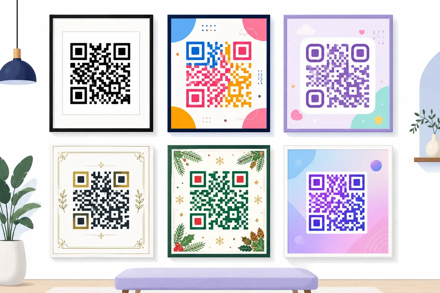
Search for QR code templates and you’ll mostly find zip files of someone else’s brand colors. What you actually need is a recipe: which palette, which module shape, what the frame should say, and why it all still scans. Here are 20 of those recipes, organized by where the code will live — business cards, restaurant tables, event posters, packaging, and the fun seasonal stuff.
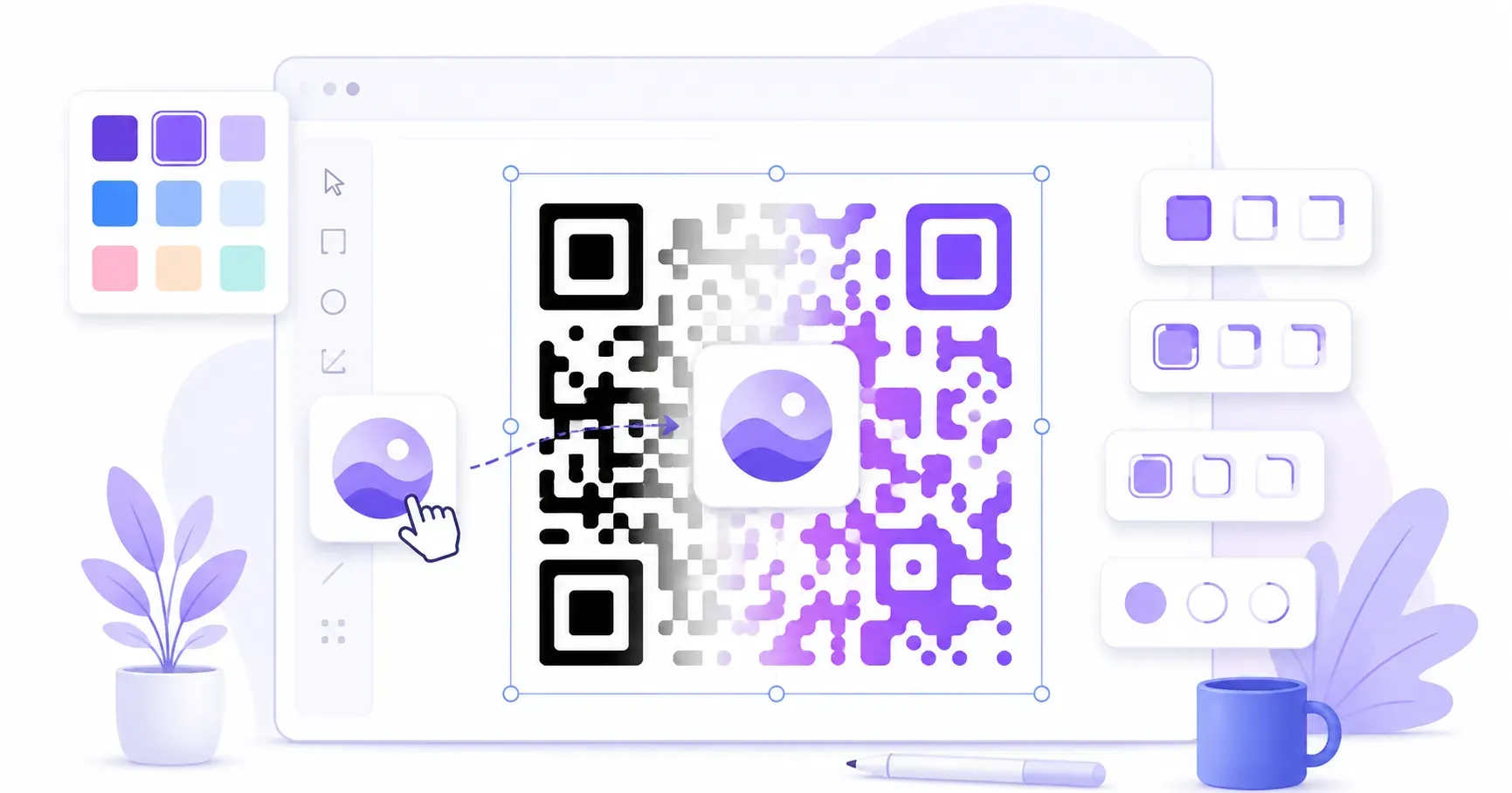
Every idea below is described precisely enough to rebuild in the free QRocket studio in minutes: pick a content type, dial in colors and shapes, add a frame, and let the live scannability meter confirm it works. No downloads, no account, and the finished code never expires. Rough hex values give each recipe a concrete starting point.
Why QR Code Design Matters
A bare black-and-white square gets ignored because it explains nothing. A styled code with a labeled frame answers the two questions every passer-by silently asks: what is this and what do I get for scanning?
The catch is that every styling choice trades against readability. Scanners need three things: strong contrast between dark modules and a light background, a clear quiet zone of empty margin around the pattern, and intact finder squares in three corners. Our full QR code design guide covers the mechanics; the short version is that color, shape, and logo choices are all fair game as long as those three survive. Each template below ends with a scannability note flagging where its risk lives.
Business Card QR Code Templates
A business card code is scanned from 20–30 cm away, so it can be small — but never below about 2 × 2 cm. Three classic card personalities follow; for placement strategy, see our guide to QR codes on business cards.
1. The Letterpress Minimal
The look: near-black ink (#1A1A1A) on warm off-white (#FAF7F2), plain square modules, classic square finders, no logo. The restraint is the design — it reads like a letterpress detail, not a tech add-on.
Frame/CTA: a thin-line frame with small caps: “SAVE MY CONTACT”.
Best for: consultants, lawyers, architects — any quiet, typographic card. Encode a vCard so one scan saves your details.
Scannability: near-perfect — maximum contrast and zero decoration make this the safest small-format code in print.
2. The Brand-Block Bold
The look: deep brand-navy modules (#1B2A4A) on white, rounded modules, circular finder centers, and your logo centered at under 20% of the code area. It turns the code into a second logo lock-up.
Frame/CTA: a filled navy frame bar underneath: “Let’s connect”.
Best for: sales teams and founders who hand out cards at volume.
Scannability: solid — navy on white has plenty of contrast. The logo is the only risk, so follow the 20% rule from our guide to adding a logo to a QR code and let error correction cover the hidden modules.
3. The Reverse Panel
The look: for charcoal or black cards. Instead of inverting the code — light modules on dark fail on many scanners — place a white rounded-corner panel on the dark card (#2B2B2B) and print a standard dark code (#111827) inside it. The panel doubles as a generous quiet zone.
Frame/CTA: no frame — a line of white type under the panel: “Scan to save my details”.
Best for: dark, premium card stocks where a floating white square looks intentional.
Scannability: excellent, precisely because you resisted inverting. The panel guarantees contrast and margin in one move.
Restaurant and Café QR Code Templates
Food-service codes get scanned in bad light, at odd angles, by hungry people, so warm palettes must keep genuinely dark modules. Our guide to QR codes for restaurants covers menu-linking strategy; these four cover the look.
4. The Espresso Menu Card
The look: espresso-brown modules (#3E2723) on cream (#FFF8E7), rounded modules, a small cup or wordmark logo in the center. It sits on the printed menu itself, linking to allergen details or the full wine list.
Frame/CTA: cream frame, brown text: “Scan for the full wine list”.
Best for: cafés and bistros whose print menus are short by design.
Scannability: strong — dark brown on cream keeps nearly black-on-white contrast while feeling warm.
5. The Table-Tent Terracotta
The look: classic black dot-style modules on white, wrapped in a bold terracotta frame (#C1543C). The color lives in the frame, where it can’t hurt the scan.
Frame/CTA: terracotta frame, white text: “Menu & today’s specials”.
Best for: table tents and counter stands scanned from 30–50 cm — print at least 3 × 3 cm.
Scannability: excellent. Putting personality in the frame instead of the pattern is the most reliable styling trick in this gallery.
6. The Chalkboard Window
The look: deep forest-green modules (#1E3B2E) on an off-white panel, rounded finder frames, no logo. Printed large on a window cling so the after-hours crowd can browse the menu from the sidewalk.
Frame/CTA: “Peek at the menu” in hand-lettered-style type above the code.
Best for: storefront glass scanned from a meter or more — print at least 10 × 10 cm, roughly one-tenth of the scanning distance.
Scannability: good if you keep the green this dark; mid-tone greens are a classic contrast failure. Avoid spots where glass glare hits at eye level.
7. The Happy-Hour Highlight
The look: jet-black modules on white with an amber accent (#F5B301) only in the finder frames — QRocket styles finder frames and centers independently, which is exactly the restrained pop this needs.
Frame/CTA: amber frame bar: “Happy hour menu — 4 to 6”.
Best for: bar tops and restroom posters promoting a time-limited menu page.
Scannability: very strong — amber is too light for modules but safe as a finder accent against dark shapes.
Event and Conference QR Code Templates
Event codes live at every distance — badge at arm’s length, poster across a lobby, backdrop across a hall — and size rules shift accordingly. More on the full workflow in our guide to QR codes for events.
8. The Badge Companion
The look: strict black on white, square modules, no logo, sized 2.5 × 2.5 cm on the badge’s lower third. Encodes a vCard or profile URL so introductions end in a scan instead of a typo.
Frame/CTA: micro-frame: “Scan to connect”.
Best for: conference name badges and lanyard inserts.
Scannability: small print size is the whole risk — hence zero decoration. Export as SVG for the badge printer.
9. The Poster Beacon
The look: midnight-navy modules (#0F172A) on white with violet finder centers (#6D28D9), rounded modules, event logo centered. Sits in the poster’s bottom quarter at 12 × 12 cm or larger.
Frame/CTA: filled violet frame: “Get your ticket”.
Best for: lobby posters and elevator signage scanned from 1–2 meters.
Scannability: strong at size — the violet stays in the finder centers while the navy modules carry the contrast load.
10. The Ticket Stub
The look: monochrome ink (#111111) on ticket-white stock, rounded finder frames for a stamp-like feel, no logo. Encodes a calendar-event QR so one scan drops the date, time, and venue into the attendee’s calendar.
Frame/CTA: thin frame: “Add to your calendar”.
Best for: printed tickets, confirmation postcards, and save-the-dates.
Scannability: excellent. Calendar payloads are denser than short URLs, so the modules run finer — one more reason to stay high-contrast and logo-free.
11. The Stage-Backdrop Giant
The look: an oversized code — half a meter or more — in pure black on white, plain square modules, mounted beside the stage or on the step-and-repeat wall. At this scale the code itself is the graphic design.
Frame/CTA: one huge line above it: “Join the live Q&A”.
Best for: session feedback forms, speaker slides, sponsor giveaways.
Scannability: great if you respect the quiet zone — backdrops love to crowd artwork against the pattern. Leave four modules of empty margin on every side.
Retail and Packaging QR Code Templates
Packaging codes fight busy artwork, curved surfaces, and tiny real estate. The winning pattern here: give the code its own calm patch of layout and check contrast against the actual substrate, not your screen — our QR code colors guide has the full palette rules.
12. The Kraft Package Stamp
The look: deepest espresso-black modules (#2A1A0F) stamped-style on a kraft box. Kraft tan (#D9B382) is darker than white, so contrast shrinks — the honest fix is a white label patch, styled to read as part of the rustic aesthetic.
Frame/CTA: “How to brew it” or “Meet the maker” in stamp-style type.
Best for: coffee bags, candle boxes, artisan packaging linking to instructions or a story page.
Scannability: fine on a white label, marginal directly on kraft. If the meter dips on dark-on-tan, believe it.
13. The Shelf-Talker Signal
The look: dark crimson modules (#7F1D1D) on white, circular finder centers, small brand mark in the middle. Clipped to the shelf edge under the product.
Frame/CTA: crimson frame: “See it in action” linking to a demo video.
Best for: electronics, kitchenware, anything that sells better moving than boxed.
Scannability: good — crimson this dark holds contrast; resist brightening toward true red. The meter, not the mood board, wins.
14. The Receipt Footer
The look: pure black on thermal white, plain square modules, no logo, no color. Thermal printers are low-resolution, so this is deliberately the plainest template in the gallery.
Frame/CTA: one printed line above the code: “Rate your visit — 30 seconds”.
Best for: feedback forms and return-policy pages at the bottom of receipts.
Scannability: excellent as long as it stays plain — any decoration a thermal head must render is a decoration that can smear.
15. The Unboxing Insert
The look: a thank-you card in the box: brand-teal modules (#0F5257) on soft white (#FDFDFB), rounded modules, logo centered, margins generous enough that the code reads like a gift tag rather than an ad.
Frame/CTA: filled teal frame: “Get 10% off your next order”.
Best for: e-commerce brands turning one purchase into a second via a coupon page.
Scannability: strong — deep teal on near-white passes comfortably, and inserts get scanned close-up in good light.
Creative and Seasonal QR Code Designs
This is where QR code templates get to show off — weddings, holidays, art-directed pieces. When a design leans decorative, raise error correction; our error correction guide explains how those levels buy back covered or damaged modules.
16. The Wedding Garden
The look: soft charcoal modules (#3D3A38) on blush-tinted white (#FDF6F4), dot-style modules, petal-like finder centers from QRocket’s creative finder set, and a tiny monogram at the center. Printed on the invitation suite, linking to the wedding site.
Frame/CTA: delicate thin frame: “RSVP & details”.
Best for: invitations, welcome signs, and table cards where the code should whisper.
Scannability: good — charcoal on blush keeps contrast while feeling soft. Keep the monogram small and error correction high.
17. The Holiday Pine
The look: pine-green modules (#14532D) on snow white, rounded modules, star-shaped finder centers, no logo. Seasonal without a single clip-art snowflake touching the pattern.
Frame/CTA: green frame with white text: “Holiday hours & gift guide”.
Best for: December window clings, gift tags, and countertop cards.
Scannability: strong — the festivity lives in finder shapes and frame text while the module field stays dark and clean.
18. The Midnight Pumpkin
The look: black modules on white with pumpkin-orange finder frames (#EA580C), sharp square modules for a slightly severe mood. Halloween energy from two accents, zero contrast sacrificed.
Frame/CTA: orange frame: “Dare to scan”.
Best for: party invites, haunted-house promos, October menu specials.
Scannability: excellent — orange is too light for modules but ideal as a finder-frame accent.
19. The Sunset Two-Tone
The look: the gradient feeling without gradient risk: deep plum modules (#3B0764) with sunset-orange finder frames (#EA580C) on warm white. True gradient fills are a job for a designer plus careful testing; this two-tone recipe gets 90% of the vibe with none of the failure modes.
Frame/CTA: plum frame: “See the summer collection”.
Best for: lookbooks, festival flyers, and social-media-adjacent print.
Scannability: strong — both tones are dark where it counts.
20. The Gallery Piece
The look: an oversized art print — the code at 30 × 30 cm in pure black on gallery white, extra-rounded modules, circular finders, and a quiet zone so generous it reads as negative space.
Frame/CTA: no frame; a single museum-label caption beneath: “Scan the artist’s statement”.
Best for: studio walls, exhibition entries, portfolio open houses.
Scannability: near-perfect. Maximum contrast, maximum size, maximum margin.
Every recipe above is free to rebuild — colors, shapes, logos, frames, no account. — Create Your Free QR Code
From Recipe to Print in Five Minutes
The pattern behind all 20 ideas is the same: dark modules on a light background, personality pushed into the safe zones — frames, finder shapes, a modest logo — and a CTA that names the reward. Pick the template closest to your use case and nudge the hex values toward your brand while the meter keeps you honest. Before anything reaches a printer, run our checklist for testing a QR code before printing. A template is inspiration; a tested code is a deliverable.
Frequently Asked Questions
Where can I download free QR code templates?
You mostly don’t need template files — you need the recipe. Each design above lists its palette, shapes, and frame text, and you can rebuild any of them free in the QRocket studio in minutes. SVG and high-res PNG exports mean the result is print-ready without a template file changing hands.
Can I customize the look of my QR code?
Yes. QRocket lets you change colors, pick module shapes, style finder frames and centers (including creative shapes), add a center logo, and wrap the code in a frame with call-to-action text. A live scannability meter warns you when a combination gets risky.
Do colored and decorated QR codes still scan reliably?
They do, if you follow three rules: keep the modules clearly darker than the background, preserve the quiet zone around the pattern, and keep any center logo under about 20% of the code area with error correction raised. Every failed fancy code broke one of those three.
What colors should I avoid in a QR code template?
Avoid light module colors — yellow, pastel pink, light gray, mint — and avoid inverting to light-on-dark, which many scanners misread. Reds, greens, and blues all work when deep and dark; the test is contrast against the background, not the hue.
Can I use the same QR code design for print and screens?
Yes — the same static code works everywhere, and it never expires. Use the SVG for print so it scales without blurring, and a high-resolution PNG for slides and screens. Just retest at the final displayed size — a design that scans at poster size may fail as a tiny footer graphic.
Create a free QR code with custom colors, your logo and print-ready downloads — no sign-up.