QR Code Design: How to Customize Colors, Logos, and Styles
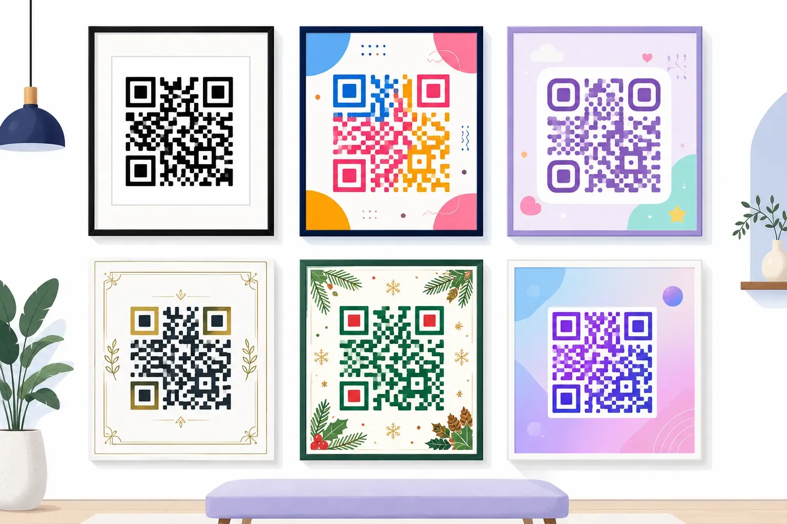
A plain black-and-white QR code on a restaurant menu gets ignored. A deep-navy code with rounded corners and the restaurant’s fork-and-knife logo in the center? That gets scanned. Custom QR code design turns a forgettable square into a branded touchpoint that people actually notice and trust. The difference isn’t just cosmetic — branded codes can see noticeably higher scan rates than generic ones, simply because they look intentional rather than suspicious. In this guide, you’ll learn the exact color contrast rules, logo sizing limits, and style choices that make a QR code look polished without breaking its scannability. Whether you’re designing for a product label, an event badge, or a storefront window, every rule here keeps your code functional first and beautiful second.
Why Custom QR Code Design Matters
Picture two business cards side by side on a conference table. Both link to the same portfolio site. One has a default black-and-white QR code; the other has a dark teal code with soft rounded dots and a small personal logo at the center. Which one gets picked up first?
Design signals credibility. When a QR code matches your brand’s color palette and includes a recognizable mark, it tells scanners three things: this is intentional, this is professional, and this is safe to scan. That last point matters more than most people realize — with QR code scam concerns rising, a branded QR code stands apart from the anonymous squares plastered on phone poles.
A custom QR code design also improves recall. If someone sees your brand colors on a poster, a flyer, and a product box, the QR code becomes part of your visual identity rather than an afterthought taped onto it.
But design has hard limits. Push too far — too little contrast, too large a logo, too small a quiet zone — and the code won’t scan at all. The rest of this guide gives you the specific boundaries to work within.
Color Rules That Maintain Scannability
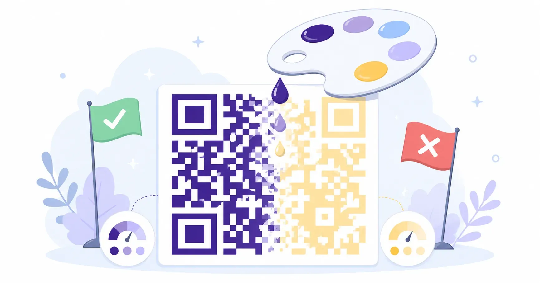
Here’s the single most important rule in QR code colors: the foreground (the dark modules) must always be darker than the background. Invert that, and most smartphone cameras will fail to read the code entirely.
The technical standard calls for at least a 40% contrast ratio between the dark and light modules. In practice, that means dark blue on white works. Dark green on cream works. Medium gray on light gray? That’s a scan failure waiting to happen.
Here’s a quick reference for safe and risky color combinations:
| Combination | Foreground | Background | Scannable? |
|---|---|---|---|
| Classic | Black | White | Yes |
| Brand navy | #1B2A4A | #FFFFFF | Yes |
| Forest on cream | #1A3C2A | #FFF8E7 | Yes |
| Red on pink | #8B0000 | #FFE4E1 | Yes |
| Light gray on white | #BBBBBB | #FFFFFF | No |
| White on black (inverted) | #FFFFFF | #000000 | No |
| Yellow on white | #FFD700 | #FFFFFF | No |
Gradient backgrounds are risky. If the gradient lightens too much near a dark module, contrast drops below readable levels. Stick to solid backgrounds unless you’ve tested on at least 3 different phone models.
Key takeaway: Always test your colored QR code on both iOS and Android before printing. What looks fine on your monitor may scan poorly on older camera hardware.
One more detail people miss: transparent backgrounds. If you export a QR code as a PNG with a transparent background and place it on a dark poster, the “light” modules disappear. Always set an explicit background color. For a deeper library of tested pairings, see our guide to QR code colors that work.
How to Add a Logo to Your QR Code
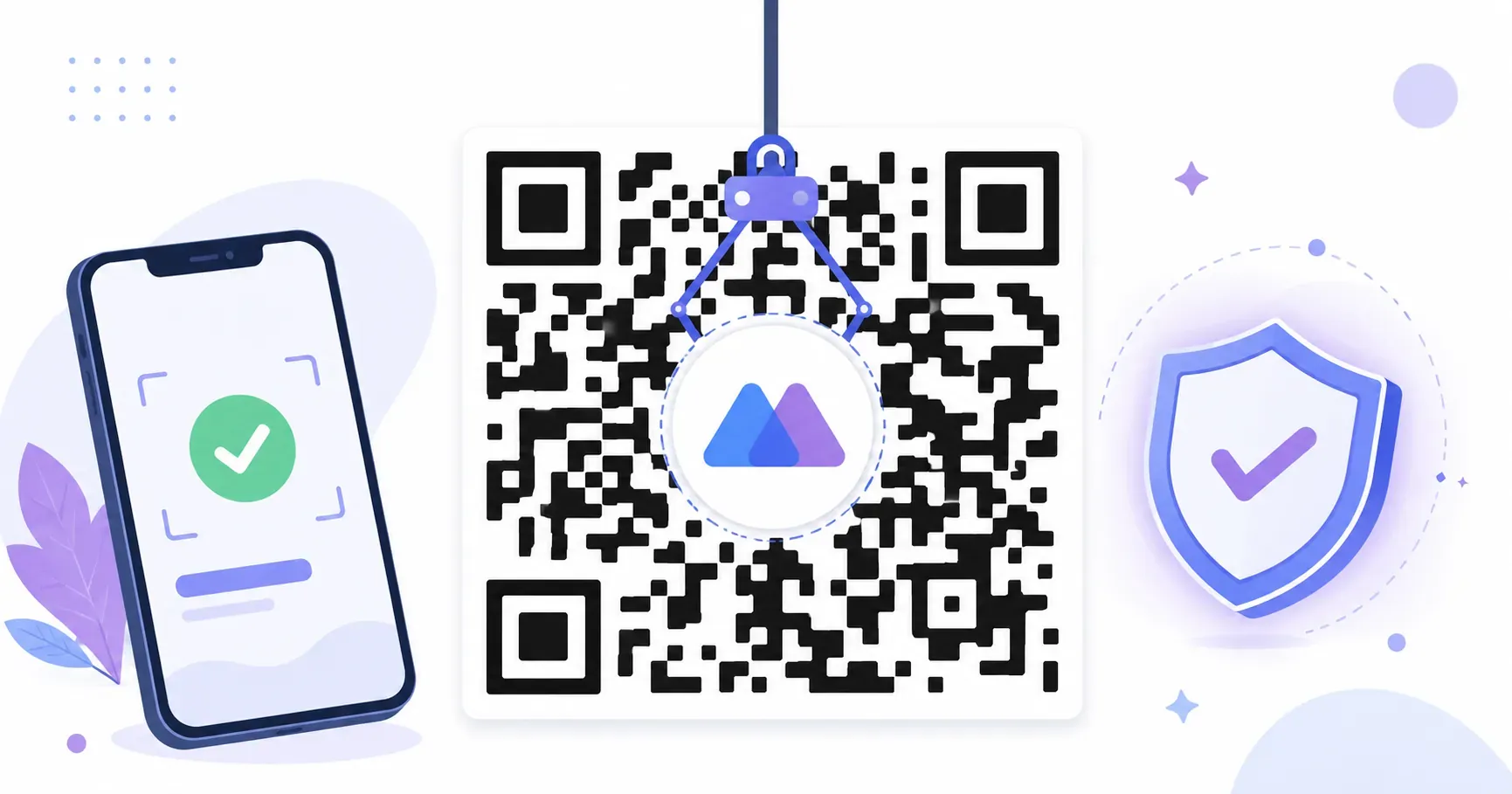
A small logo in the center of a QR code is the fastest way to make it look branded. But there’s a hard engineering limit: the logo covers data modules, so it must be small enough for the code’s error correction to compensate.
The safe maximum is 30% of the total QR code area. For a code that’s 300 x 300 pixels, that’s roughly a 90 x 90 pixel logo zone in the center. Go beyond that, and you’re destroying more data than error correction can recover — the code looks great but won’t scan.
To make a QR code with logo work reliably, set the error correction level to High (H). QR codes have four error correction levels — Low (7%), Medium (15%), Quartile (25%), and High (30%). The High level rebuilds up to 30% of damaged or obscured data, which is exactly what a center logo creates.
Best practices for logo placement:
- Use a simple mark. A wordmark with thin serifs or a detailed illustration will blur at small sizes. A bold icon or monogram scans best.
- Add a small white border (2-3 pixels) around the logo so it doesn’t bleed into adjacent modules.
- Keep it centered. Off-center logos overlap with the QR code’s positioning patterns (the three large squares in the corners), which are critical for scanners to detect orientation.
- Avoid transparency in the logo. A logo with a transparent background placed over dark modules creates visual noise that confuses readers.
If your brand logo is complex — say, a detailed crest with fine lines — consider using a simplified version or just the brandmark initial for your QR code with logo integration. For a step-by-step walkthrough, see how to add a logo to your QR code.
Choosing the Right QR Code Shape and Style
Standard QR codes use sharp square modules. But you’re not limited to squares, and this is where QR code style gets creative.
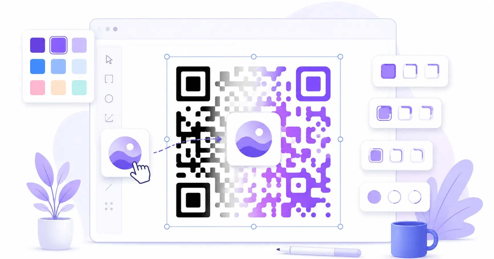
Module shapes (the individual dots that make up the code) can be rounded, circular, or even diamond-shaped. Rounded modules give a softer, more modern aesthetic QR code appearance — think of it as the difference between a brutalist building and one with curved glass. Both are structurally sound, but they communicate different things.
Eye shapes — the three large positioning squares in the corners — can also be customized independently. You can pair rounded module dots with circular eye borders, or keep square eyes with rounded dots for contrast. The eyes are how scanners orient the code, so keep their overall shape recognizable even when styling them.
Here are the most common style combinations:
| Style | Modules | Eyes | Best For |
|---|---|---|---|
| Classic | Square | Square | Legal, government, medical |
| Modern | Rounded | Rounded | Tech brands, SaaS, apps |
| Playful | Circular dots | Circular | Events, food, retail |
| Elegant | Rounded | Square outer, round inner | Luxury brands, fashion |
Dot density also affects perception. A Version 2 QR code (25 x 25 modules) encoding a short URL looks clean with large dots. A Version 10 code (57 x 57 modules) encoding a full vCard has tiny, tightly packed dots that can feel cluttered. When possible, keep the encoded data short — use a URL shortener or a redirect — to produce a lower-version code with larger, more visible modules.
Design your branded QR code for free with QRocket — add colors, logos, and custom styles — Create Your Free QR Code
If you’re creating a vCard QR code for business card use, module style matters even more. The code will be printed at roughly 25 x 25mm, so rounded or circular modules read better at that scale than sharp squares with tight gaps.
Frames and Call-to-Action Labels
A bare code on a poster raises a silent question: scan for what? A frame answers it. Wrapping the code in a thin border with a short label — “Scan me,” “Scan for menu,” “Scan to save 15%” — tells passersby exactly what they’ll get, and that context reliably lifts scan rates over an unlabeled square.
Keep the frame simple. A single-weight outline in your brand color, with the call-to-action tab along the bottom, reads clean at any size. Resist stacking a frame, a logo, and a gradient all at once — the code should still look like a code.
The one rule a frame can break by accident is the quiet zone. That blank margin of at least 4 modules has to sit inside the frame, between your border and the code itself. If the frame line crowds the modules, scanners lose the code’s edge. Give the pattern its breathing room, then draw the frame around the whole thing, label included.
Custom QR Code Design Mistakes to Avoid
A well-designed QR code walks a narrow line between branded and broken. Here are the mistakes that push codes over the edge.
1. Insufficient contrast. This is the number-one design failure. Designers pick a light brand color for the foreground because it “looks cleaner” — and the code becomes unreadable. If your brand color is light (yellow, light blue, pastel pink), use it as the background and pick a dark foreground instead.
2. Logo too large. Covering more than 30% of the QR area with a logo guarantees scan failures, even with High error correction. If your logo needs to be prominent, place it next to the code rather than inside it.
3. Missing or shrunk quiet zone. The quiet zone is the blank margin around the QR code — at minimum, it should be 4 modules wide (roughly 2-3mm in print). Designers who crop the code to its edges or butt it against other design elements remove this buffer, and scanners can’t detect where the code starts.
4. Decorative overload. Adding background images behind QR modules, using multi-color gradients across individual dots, or overlaying textures all reduce readability. One or two customizations (color + rounded modules, or brand color + logo) look polished. Five customizations at once look chaotic and scan poorly.
5. Not testing at final size. A QR code that scans perfectly on a monitor at 800 pixels wide might fail when printed at 20 x 20mm on a business card. Always test at the actual print size. Our QR code size guide covers minimum dimensions for every use case.
Design Your Custom QR Code with QRocket
QRocket makes it straightforward to build a branded QR code without needing a graphic design tool. You can create a QR code for free with full control over colors, logo, and module styles — all from one screen.
Here’s how to approach the design process:
Start with your content type. Select URL, WiFi, vCard, or whichever type matches your use case in the QR generator. Enter your data first — this determines the code’s version and density, which affects how much room you have for styling.
Set your colors. Pick a dark foreground color that matches your brand — hex codes give you exact control. Set the background to white or a light brand color. Check the contrast visually: if you squint and the modules blur into the background, go darker.
Add your logo. Upload a square PNG or SVG of your logo. Keep it under 30% of the QR area. QRocket automatically centers it. If the preview shows modules crowding the logo edges, use a slightly smaller file.
Choose your style. Select module shape (square, rounded, dots) and eye style. Preview the result at different sizes — toggle between the on-screen preview and a downloaded test print if the code is going to physical media.
Download and test. Export as PNG for digital use or SVG for print. Scan the final file with at least two different phones before sending it to production. This 30-second test saves hours of reprinting.
The entire process takes under 2 minutes, and every QR code you generate through QRocket is free to create, download, and use commercially.
Restraint Is the Real Design Skill
Good custom QR code design is really about restraint: one or two deliberate choices — a brand color, a clean logo, rounded modules — make a code look polished and trustworthy. Stack too many effects, and you get a code that looks creative but won’t scan from 2 feet away. Start with contrast and scannability, then layer on style. Your next branded QR code is a quick build away.
Frequently Asked Questions
Can I change the color of my QR code?
Yes. Set any dark foreground color with a contrasting light background. Avoid light-on-light or inverted (light foreground, dark background) schemes, which cause scan failures on most devices. Test on both iOS and Android before finalizing.
How big can the logo be inside a QR code?
Keep the logo under 30% of the total QR code area. For a 300 x 300 pixel code, that’s about 90 x 90 pixels maximum. Pair it with High (H) error correction, which recovers up to 30% of obscured data.
Will a colored QR code still scan?
Yes, if the contrast between dark and light modules meets the 40% minimum ratio. Dark navy, forest green, or burgundy on white all work well. Light colors like yellow, pastel blue, or beige as foreground colors will likely fail.
What is the quiet zone on a QR code?
It’s the blank margin surrounding the QR code — at least 4 modules wide — that helps scanners detect the code’s boundaries. Cropping this margin or placing design elements too close to the code edge causes read failures.
Do rounded or dot-style QR codes still scan?
Yes. Scanners read the contrast between light and dark modules, not the corner radius, so rounded or circular dots decode just fine. The one part to leave conventional is the three finder patterns in the corners — reshape those too aggressively and some cameras lose orientation.
Does a designed QR code scan slower?
Not meaningfully. A well-made branded code decodes as fast as a plain one, because the camera locks onto the same finder patterns either way. What actually slows a scan is poor contrast or a crowded quiet zone — style itself costs nothing as long as the fundamentals hold.
Create a free QR code with custom colors, your logo and print-ready downloads — no sign-up.