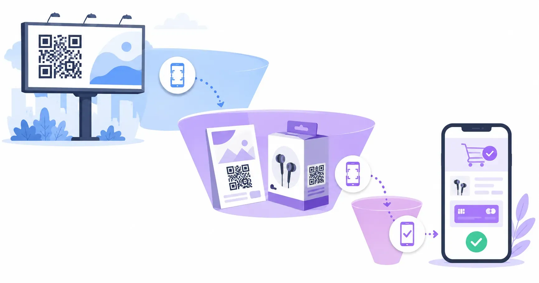
QR Code Call to Action Examples That Actually Get Scanned
Two cafés on the same street print the same QR code linking to the same loyalty signup. One frames it with the words “QR code.” The other writes “Scan for a free coffee on your 5th visit.” The codes are identical; the scan counts won’t be close. The words next to a code do most of the persuading, which is why collecting strong QR code call to action examples — and understanding why they work — pays off faster than any design tweak.
This guide gives you the copy formula behind high-performing CTAs, a swipe file of examples organized by use case and industry, placement rules that make the CTA readable at scanning distance, and the signage mistakes that quietly zero out scan rates.
Why a Call to Action Changes Your QR Scan Rate
A bare QR code is a locked box. It communicates that something is behind it, but nothing about whether that something is worth ten seconds of a stranger’s attention — and unexplained effort is precisely what people decline. A call to action unlocks the box in advance: it names the reward, so scanning becomes a known trade instead of a gamble.
Marketers who test labeled codes against bare ones consistently report large differences in scan behavior — unsurprising, since the CTA answers the only question a passer-by is actually asking: what do I get? The effect is strongest with cold audiences (posters, packaging, windows) and weakest where context already explains the code, like a menu code on a restaurant table.
There’s a second, subtler job the CTA performs: it filters. “Scan for wholesale pricing” attracts exactly the scanner you want and politely waves off everyone else, which matters when the destination is a sales conversation. A code without copy doesn’t just get fewer scans — it gets random ones. That’s why CTA copy sits at the center of any serious QR code marketing strategy, not at the end of it.
What Good QR Code CTA Copy Looks Like
Nearly every strong QR call to action follows one formula:
Action verb + specific benefit (+ time or format cue, if it helps).
Compare the pattern against what usually gets printed:
| Weak | Strong |
|---|---|
| Scan me | Scan for the full menu |
| QR code | Get 10% off your first order |
| Learn more | Watch the 60-second setup video |
| Visit our website | Book your free consultation |
| More info | See this home’s virtual tour |
The strong column shares four traits worth copying:
- It leads with a verb. Scan, get, watch, book, see — the reader knows the required action and the reward in the same breath.
- It names a specific outcome. “The full menu,” not “more information.” Specificity is believability.
- It’s under 8 words. CTAs get read in a glance or not at all.
- It sets format expectations when useful. “60-second video” and “free PDF guide” tell people what they’re committing to, which lowers the perceived cost of scanning.
One more trust signal belongs in the fine print: a short hint of where the scan leads, like “qrocket.io” under the code. With QR phishing on the rise, savvy scanners check for it — our guide to QR code safety explains why that small line increasingly earns scans on its own.
QR Code CTA Examples by Use Case and Industry
Steal from this list, then tighten to fit your placement:
Restaurants and cafés
- “Scan for today’s menu”
- “Order and pay from your table”
- “Free dessert? Join our list”
- “Loved it? Leave us a quick review” — pairs naturally with a Google review QR code
Retail and packaging
- “Scan for 15% off your first order”
- “Watch how it’s made”
- “Get care instructions and sizing”
- “Reorder in 10 seconds”
Real estate
- “See the virtual tour”
- “Get the floor plan and price”
- “Scan to book a viewing”
Events
- “Scan to register — 30 seconds”
- “Get the full schedule”
- “Save this event to your calendar”
Services and B2B
- “Get a free quote today”
- “Book a 15-minute demo”
- “Download the buyer’s guide (free PDF)”
- “Join the waitlist” — the core move in using QR codes for lead generation
Hospitality and venues
- “Connect to free WiFi” — with a WiFi QR code, the scan itself does the connecting
- “Scan for the guest guide”
Customer support
- “Questions? Chat with us on WhatsApp”
- “Scan for setup help”
Notice that none of these mention the technology. The customer isn’t interested in QR codes; they’re interested in dessert, discounts, and floor plans. The code is plumbing — the CTA sells the water.
Pair a CTA that earns the scan with a code built to convert — free, no sign-up. — Create Your Free QR Code
Where to Place the CTA Near the QR Code
Good copy in the wrong position still fails. Four placement rules cover almost every layout:
- Directly above or below the code. These are the standard positions, and both work — below is slightly more common because the eye lands on the code first, then drops for the explanation. Side placement with an arrow works on wide layouts like banners.
- Outside the quiet zone. The code needs its blank margin — at least four modules wide — on all sides. Text that crowds into that margin doesn’t just look cramped; it can break scanning outright.
- Readable from the scanning distance. This is the most-violated rule in signage. If the code is sized to scan from 2 meters, but the CTA is legible only from 50 cm, the CTA effectively doesn’t exist. Match the type size to the code size — as a starting point, make the CTA’s cap height at least 10–15% of the code’s width.
- Visually attached to the code. A frame around code and caption, a camera icon, or a small arrow binds the promise to the action. QRocket’s built-in frames put the CTA text inside the code’s visual unit, so the pair reads as one object — and the overall look stays on-brand when you follow the basics in our QR code design guide.
Signage Copy Mistakes That Kill Scans
The same handful of errors shows up on storefronts and trade show booths everywhere:
- No text at all. A naked code relies on curiosity, and curiosity is a weak, shrinking motivator now that codes are everywhere.
- “Scan me” as the entire pitch. Better than nothing, but it names the action without the reward — the half of the formula that persuades is missing.
- Explaining the mechanism, not the benefit. “Point your phone camera at this QR code to be directed to our website” spends 14 words saying nothing a phone owner needs. Spend them on the offer.
- Overpromising. “Scan for a surprise” gets one-time scans and lasting distrust when the surprise is a mailing-list form. The destination must cash the check the CTA writes.
- Mismatched effort. “Quick 30-second signup” leading to a 12-field form kills the conversion and poisons your next code’s credibility.
- Tiny codes with long essays. A 2 cm code beside a paragraph of copy inverts priorities — right-size the code first (our size guide has the ratios), then let a short line do the talking.
- Forgetting the offline moment. A CTA on a subway poster promising a video assumes bandwidth the rider may not have. Match the destination to the context of the scan.
The pattern behind every mistake: the sign was written from the business’s perspective (“we have a QR code”) instead of the scanner’s (“here’s what I get”).
Write the Reward, Not the Technology
Delete the phrase “QR code” from your signage vocabulary and something clarifying happens: you’re forced to sell whatever is actually behind the scan. That’s the whole discipline in one move — the code is an ingredient, never the headline. The strongest CTAs in this article would work almost unchanged as button copy on a website, which is exactly the test worth applying: if your sign’s text would make a bad button, it makes a bad QR caption too. Write the button first, then build the code to match — QRocket’s generator adds the framed CTA text in one step, and the copy will already be the hard part you’ve solved.
Frequently Asked Questions
Should I write “Scan me” next to a QR code?
Only if you can’t say anything more specific. “Scan me” beats a bare code because it prompts action, but it omits the reward — and the reward is what persuades. A benefit-driven line like “Scan for 10% off” consistently outperforms generic prompts, at identical printing cost.
How long should a QR code CTA be?
Under 8 words. Signage is read in a glance, so lead with a verb and get to the benefit immediately: “Get the free guide,” “See the virtual tour,” “Order from your table.” If you need a second line, use it for trust or format cues — like the destination domain or “takes 30 seconds.”
Does every QR code need a CTA?
Almost every public-facing one does. The exception is codes whose context already explains them, like a boarding pass or a code labeled by the app requesting it. On posters, packaging, windows, and booths — anywhere scanning is optional — the CTA is the difference between an invitation and a mystery.
Should the CTA go above or below the QR code?
Both work; below is slightly more common because the eye finds the code first and drops down for the explanation. What matters more is that the text sits outside the code’s quiet zone, reads clearly at the same distance the code scans from, and is visually attached to the code with a frame, arrow, or icon.
What font size should QR code signage text be?
Big enough to read wherever a person stands to scan. A workable starting point is a cap height of 10–15% of the code’s width — roughly 18–24 pt text beside a 5 cm code viewed at arm’s length, scaling up proportionally for posters. Always check readability at real distance on a printed proof.
Do QR code CTAs work on product packaging?
Yes — packaging is one of the strongest placements, because the scanner is already a customer holding the product. Effective packaging CTAs extend the product experience: care instructions, setup videos, recipes, reorder links, and warranty registration. Keep the code at least 2 × 2 cm and away from folds and curves.
Create a free QR code with custom colors, your logo and print-ready downloads — no sign-up.